7 design tips for a modern minimalist home
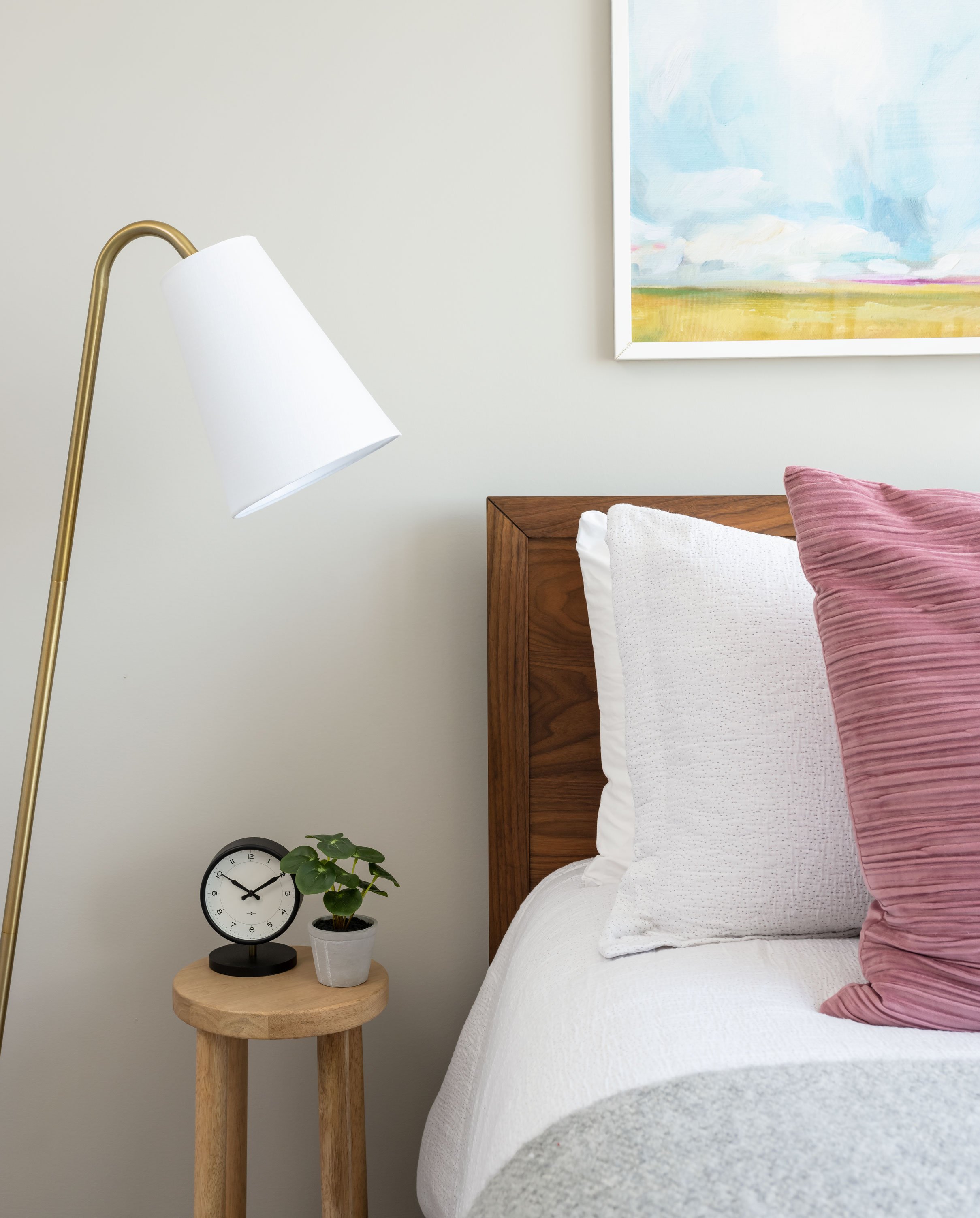
So what is modern minimalist? If you know the term minimalist you sometimes picture something stark or cold, well the modern version of that brings more warmth, life and interest to a space without feeling busy or loud. It’s a delicate balance creating a modern minimalist home, it’s not too simple but not too fussy. When designing my clients homes I go along with the following 7 design tips to achieve the look.
form follows function
Have you ever heard the term “form follows function”? It was a design theory by architect Louis Sullivan. Essentially the function or use of the space must always come first, and the aesthetic or style comes second. The theory was later “debunked” by Frank Lloyd Wright, who said form and function should go hand in hand. I, however, feel that function should come first, that doesn’t mean you don’t sacrifice function on certain elements for a specific design element or wow factor, but big picture of a space should always function or have a purpose that leads the design, so keep that in mind on the remaining design tips!
shape
When thinking about shapes, you always want your eyes to keep moving throughout the space, having a variety will help with that. Think of a college dorm for example (yuck!): Square sofa, square side table, square coffee table… and no one wants to be a square, so mix it up! If the sofa has a more traditional curved arm try a rectangle coffee table and circle side table… or a square sofa + curved coffee table.
pattern
Go easy on patterns or the space will immediately feel busy. I like to pick one large/bolder pattern as a focal point and one small/medium as a supporting act, not every element is going to be the star, and as the saying goes ‘no such thing as a small part’.
color
A similar concept goes for colors… either pick one color and a variety of shades OR two complimentary colors, one being the dominant more saturated color while the other is a softer accent.
texture
Okay, I know what you’re probably thinking. We get it go easy + pick one to three textures like we did with shapes, patterns, and colors. Nope! Bring in ALL the textures - but keep in mind the balance of shapes, patterns + colors. (Its almost as if the first 5 design tips are in order of importance!) If a texture is on the larger scale go neutral or solid in color. if its a smaller scale texture try keeping it monochromatic, etc. okay now I think you get the gist!
A touch of black
Scrolling through pinterest + instagram we see so many all white, neutral, light rooms… that often feel a bit ‘meh’ - nice, calming, clean, relaxing, but often lacking interest. One black element gives your eyes something to settle on when wondering in the room. It grabs your attention and grounds the space.
something living
Last, but not least: while I personally love dogs, thats not quite what I mean. Bringing in nature into any space adds life… literally. So go plant shopping or propagate from a friend! If you are new to caring for plants, try a pathos, they’re super low maintenance and manageable.
products we love:
And there you have it! 7 design tips for our signature modern minimalist home. Have a question or design dilemma re: these modern minimalist design tips? Shoot us a DM on instagram! Be sure to follow along and subscribe to our monthly newsletter!


